Posts

Showing posts with the label UX

This Week I Learned - Week #51 2024

Image
This Week I Learned -   * Addy Osmani open-source   web app lets you upload your image and let AI remove the background instantly. It uses Transformers.js which has enabled a whole class of client-side AI apps to come to the web. This is free for unlimited use (Canva is free for first-time) and does all processing locally and privately (nothing is uploaded to anyone’s servers). All of the processing happens client side. This means outside of just the bandwidth to serve the page itself there’s no cost to the person hosting it. * AI assistance in Chrome DevTools is now available with Chrome 131 * Instagram recently moved from Python 2 to Python 3. Dropbox also recently upgraded fully to Python 3 * OpenAI whistleblower Suchir Balaji's article on how generative AI products violate copyrighted material. * AI Tier will replace backends - Satya Nadella *  Azure AI Agent Service is a fully managed service designed to empower developers to securely build, deploy, and...

Deceptive Patterns in Popular Indian Apps

Image
ASCI Academy and Parallel have identified 12 deceptive practices in leading Indian apps. Their 39-page report, " Study of Deceptive Patterns in Top Indian Apps [^PDF] " published in August 2024, presents a comprehensive analysis of the research on 53 popular Indian apps, offering key insights and detailing the methodology used. They have also created a website, Conscious Products , as a resource for makers to build digital products ethically.  The 12 Deceptive Patterns in brief with examples from the report -  Privacy Deception - Tricking users into oversharing personal data Interface Interference - Misleading users with selective interface information Nagging - Persistent pop-ups disrupting user tasks Drip Pricing - Gradually revealing additional costs during purchase Trick Question - Confusing language to misdirect user actions Forced Action - Requiring unwanted actions to proceed Basket Sneaking - Adding items to cart without consent False Urgency - Creating fake time or s...

This Week I Learned - Week #46 2023

Image
This Week I Learned -  * PartyRock is a fun way to learn the fundamentals of foundation models and then collaborate with other developers. Anyone can access PartyRock through the website, and you don’t need an Amazon Web Services (AWS) account. PartyRock uses foundation models from Amazon Bedrock to turn your ideas into working PartyRock apps. You don't need to be a developer or ML engineer to start creating your own apps. Just write a text-based prompt to describe what you want your app to do in the PartyRock app builder. * Amazon Bedrock is a fully managed service that makes foundation models (FMs) from Amazon and leading AI companies available on AWS available through an API. It is the easiest way to build and scale generative AI applications with foundation models. PartyRock provides builders with access to FMs from Amazon Bedrock in a code-free app-building playground to learn the fundamentals of prompt engineering and generative AI. *  Virtual Assistants (VA)...

Beware of Dark Patterns

Image
Dark Patterns (DP) are deceptive UI designs that trick users to do something they originally did not want to. These unfair trade practices violate user choice, autonomy & consent. For example, DPs include sneaking unwanted items into the basket, adding users to costly subscriptions, and misleading with double negatives (e.g., Uncheck here not to download the add-on ). Dark Patterns can also lead users to over-share personal information, thus potentially leading to privacy breaches.  The  darkpatterns.org  portal (established in 2010 by Harry Brignull) collects various examples of Dark Patterns on web and mobile applications, gathered through the reports of users via Twitter.  Neuromarketing is a new field that uses techniques such as fMRI, EEG, and gaze detection to investigate the effects of marketing inputs. Among various discoveries, neuromarketing research found that the feeling of “loosing out” is particularly effective in influencing users. Based on ...

25 Mobile Site Design Principles from a Google Research Study

Below is a summary of the article  What Makes a Good Mobile Site?  which uncovers 25 mobile site design principles, grouped into five categories: Home page and site navigation - Keep calls to action front and center - Keep menus short and sweet - Make it easy to get back to the home page - Don't let promotions steal the show Site search - Make site search visible - Ensure site search results are relevant - Implement filters to narrow results - Guide users to better site search results Commerce and conversion - Let users explore before they commit - Let users purchase as guests - Use existing information to maximize convenience - Use click-to-call buttons for complex tasks - Make it easy to finish on another device Form entry - Streamline information entry - Choose the simplest input - Provide visual calendar for date selection - Minimize form errors with labeling and real-time validation - Design efficient forms Usability and form factor - Optimize...

The 100 Greatest Designs of Modern Times

Image
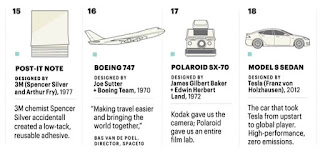
Fortune magazine partnered with the Illinois Institute of Technology (IIT) Institute of Design (ID) to poll educators, influencers, freelance designers, and corporate design teams on the creations they consider truly great and identified 100 iconic designs of modern times . Unlike a similar compilation Fortune did in 1959, the current list features not just products and objects but also systems and services. The ranking is based on five criteria - how adaptable, equitable, usable, impactful, transformational the products are. The 2020 list - 1. iPhone Designed by Apple, 2007 2. Macintosh - defined the personal computer category Designed by Apple, 1984 3. Google Search Engine Designed by Google, 1997 4. Eames Fiberglass Armchair Designed by Ray + Charles Eames, 1950 5. Sony Walkman TPS-L2 Designed by Norio Ohga, 1979 6. OXO Good Grips Peeler - an ergonomically superior peeler that Farber created for his arthritic wife. Designed by Sam Farber + Smart ...

This Week I Learned - Week #3 2020

Image
This Week I Learned - *  Application security groups enable you to configure network security as a natural extension of an application's structure, allowing you to group virtual machines and define network security policies based on those groups. You can reuse your security policy at scale without manual maintenance of explicit IP addresses. *  The icons we see on apps & websites are called by different names . The vertical stack burger icon signifying navigation drawers provide access to destinations and app functionality, such as switching accounts. The 3 dots ellipsis icon is called kebab menu by some and overflow menu by Google which uses it to represent App & placed on the right side of an app. * Now, not every project needs a framework and not every page of a single-page-application needs to load a framework. In Netflix’s case, "removing React, several libraries and the corresponding app code from the client-side reduced the total amount of JavaScript by ...

Should the OK button come first or Cancel in Windows applications?

Image
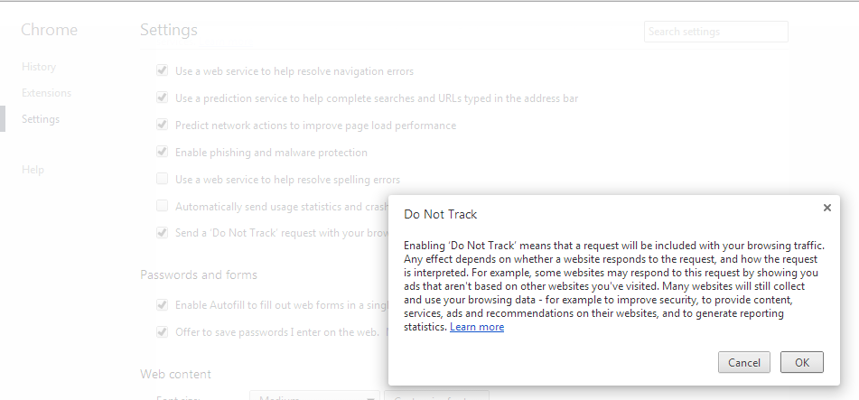
UX guru Jakob Nielsen recommends  following the platform GUI standard  when it comes to the order of the OK & Cancel buttons. The Windows User Experience Guidelines differ from the Apple Human Interface Guidelines when it comes to the sequence of OK/Cancel buttons: Windows puts OK first while Apple puts OK last. Safari browser on Windows has dialog boxes with Cancel button first. I found this unusual dialog box via a Google Chrome browser setting, breaking at least a couple of  Microsoft's user interface guidelines : click to enlarge image Also see:  Use the "inverted pyramid" for UI text in dialog boxes

Use the "inverted pyramid" for UI text in dialog boxes

Image
Microsoft's user interface guidelines recommend using the "inverted pyramid" style for UI text in dialog boxes. In the inverted pyramid structure you get right to the point with the essential information, let users stop reading at any time they choose, and use a Help link to present the remainder of the pyramid. It also recommends avoiding over-communication and u sing the prominent main instruction to explain concisely what to do. I recently ran into this Visual Studio 2012 dialog box: It did not heed to the above guidelines and it took me more than just one reading to get the message. Related: UX anti-patterns & other avoidable annoyances User Experience - Stack Exchange: Should I use Yes/No or Ok/Cancel on my message box?