A Data Visualization of Calorie and Protein Content of Various Protein-based Foods

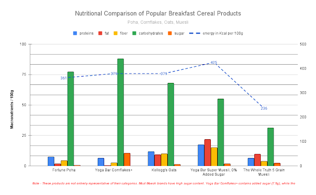
The DataIsBeautiful subreddit is a thriving hub for data enthusiasts, boasting over 21 million members passionate about visualizations. What truly distinguishes this community is the captivating blend of wisdom and humor found in the comments section. The feedback from the community is a delightful blend of insightful observations and witty, snarky remarks. The creator's on how to read this scatter plot chart, Protein vs. Calorie Density: A Visual Guide , shown below. On the axis, as you move towards the right, the food becomes more calorie-dense. Similarly, moving upwards indicates increasing protein density. Consequently: Top left indicates foods with high protein content per calorie and low calorie count per 100g. Bottom right represents foods with low protein content per calorie but high overall calorie count per 100g. Top right denotes foods with high protein content per calorie and high calorie count per 100g. Bottom left signifies foods with low protein content per ca...