Should the OK button come first or Cancel in Windows applications?
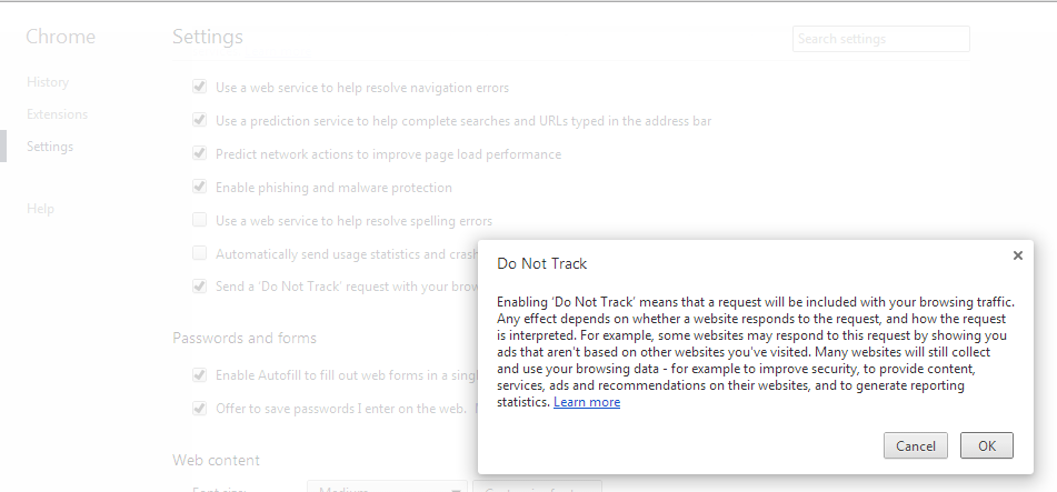
UX guru Jakob Nielsen recommends following the platform GUI standard when it comes to the order of the OK & Cancel buttons. The Windows User Experience Guidelines differ from the Apple Human Interface Guidelines when it comes to the sequence of OK/Cancel buttons: Windows puts OK first while Apple puts OK last. Safari browser on Windows has dialog boxes with Cancel button first.
I found this unusual dialog box via a Google Chrome browser setting, breaking at least a couple of Microsoft's user interface guidelines:
Also see: Use the "inverted pyramid" for UI text in dialog boxes
I found this unusual dialog box via a Google Chrome browser setting, breaking at least a couple of Microsoft's user interface guidelines:
 |
| click to enlarge image |
Also see: Use the "inverted pyramid" for UI text in dialog boxes


Comments
Post a Comment